Let’s Get Visual: Duds

MICHELLE: After a few months of this column, I feel like I’m better able to think critically about the artistic aspect of manga. I expected to be able to better appreciate good art when I see it, but hadn’t anticipated that I’d also more readily notice flaws. This month, MJ (of Manga Bookshelf) and I turn our attention to problematic pages or, as I like to call them, “duds.” (Click on images to enlarge.)

Fairy Tail, Volume 10, Page 84 (Del Rey)

MJ: Wow. I’m… a little bit stymied by that image.

MICHELLE: It is a doozy, isn’t it? Actually, that page was the inspiration for this whole column. There I was, innocently reading volume ten of Fairy Tail, then I turned the page and was brutally accosted by that monstrosity!

So, as is probably pretty obvious, the speaker is unhinged. Mangaka Hiro Mashima has opted to depict this by freezing the guy in the act of making a weird face and forcing readers to read two huge bubbles full of ranting speech before we can proceed to the final (and uninteresting) panel on the bottom of the page. Now, maybe this is a tactic to make us feel as trapped as the girl does, having to sit there and listen to this lunatic ramble on, but it doesn’t do a good job at conveying his insanity. The page feels flat and lifeless; a better choice would have been to inject more movement into the scene, break up the speech, and maybe allow the guy the opportunity to change expressions throughout his tirade.

MJ: I honestly feel accosted by the page. Its primary image is loud, but not particularly expressive in any other way than that, and the text feels overwhelming to the point where I can’t really even bring myself to try to read it all. Not only that, the page is so top-heavy, I find it difficult to even look at. That bottom image is completely wasted there, not that it’s much of a waste.

MICHELLE: Yeah, it’s weird how an amount of text that would be perfectly reasonable to read in a prose novel suddenly looks so daunting in a speech bubble, but it really does. And you’re absolutely right that it’s loud without being expressive. Everything about this page is just so glaringly bad that I knew we had to build a column around lousy art so that I’d have an excuse to talk about it with someone!

MJ: Well, feel free to talk as much as you like, because I’ve rarely seen something so pointlessly hideous. And though I hate to think that I’m reacting purely out of aesthetics, I can’t deny that it offends me greatly on that level.

MICHELLE: I think that’s pretty much the only basis on which you can be expected to react, since you haven’t read the manga in question. For me, it completely yanked me out of the story, which I find inexcusable.

And though I appreciate the offer to further vent my spleen, perhaps we should proceed on to your dud of choice.

Baseball Heaven, pages 133-134 (approx.) (BLU Manga)

MJ: Okay, then. My “dud” comes from Ellie Mamahara’s Baseball Heaven, a BL manga I expressed no great love for in our BL Bookrack column a couple of months ago. I assume I don’t need to describe what’s happening in the scene, and chances are I don’t need to tell anyone what’s wrong with it, either, but of course that’s why we’re here.

I look at this scene, and there’s simply no passion in it. None at all. Here we have a guy, supposedly in an altered state of mind, making the moves on his teammate who has rebuffed him in the past, and not only do we not get any real sense of how either of them are feeling (we wouldn’t even know the one was drunk if it wasn’t for indications in the word balloons and flushed cheeks), but there’s absolutely no sexual tension between them conveyed through the artwork. And while I can appreciate that perhaps we’re meant to believe that athletes might be stiff and awkward with each other, surely the drunk guy, at least, would have a little heat in his body language here.

The artist goes through the motions, placing them physically near each other and indicating that the one is, perhaps, touching the other’s behind, but there is just no real feeling between them at all. Even when their faces are so close together, Mamahara is unable to provide any magnetic reaction between them. I should feel that they *want* to touch each other. It should feel painful for them not to. Instead, it leaves me completely cold.

MICHELLE: I definitely see what you mean! Personally, I keep staring at that first panel on the second page. They look so stiff and awkward. It’s not that I expect the position of a character’s legs to help drive the emotional content of a scene, but when they’re as oddly placed as the blond guy’s are, it feels unnatural and, by extension, makes everything else going on in the scene feel the same way.

MJ: I think I’d go so far as to say that in a scene like *this* one, I kind of *do* expect the position of a character’s legs to help drive the emotional content of the scene. It’s just as I was saying before, there should be a sense that the characters want desperately to touch each other (this includes legs) even if they might be scared to do so. I should see that in the legs and every other part of the body, at least in the drunk guy who is initiating the contact in the first place. It’s a seduction scene with no actual seduction going on.

Also, I feel like the panels are getting in the way of us viewing the scene, which is a weird and uncomfortable feeling. And unlike in last month’s selection where this was done to elicit response from the reader, here it just feels like clumsiness on the part of the artist. She provides these little glimpses of their faces and legs in the smaller panels, but since there is no tension in those panels, they don’t add anything to the scene. They just steal space from the main action, such as it is.

Wow, I’m really ranting now, aren’t I? Please stop me.

MICHELLE: You’re quite right, but I shall stop you as requested by introducing my second dud!

Moon Boy, Volume 9, Page 3 (Yen Press)

MICHELLE: Initially, it was the affronted rooster in the lower left that caught my eye and made me pause to really take in the complete and utter randomness of this page.

You’ve got a young person of indeterminate gender, swaddled in coat and boots, flushed and exhaling a gust of wintry air, possibly due to the exertion of just having decapitated a nearby snowman. This person is surrounded by such seasonal items as a piece of pie, a cookie, a beehive (with fake bees), an inverted dog bowl, and a pair of barnyard pals.

This was enough to have me snickering, but closer inspection reveals several problems in proportion and perspective. For one, take a look at that snowman’s nose. I’m pretty sure that is supposed to be the traditional carrot, but the artist was unable to draw it from a head-on perspective so instead it looks like a giant almond. Secondly, check out the boots. The right foot is clearly much larger than the left, and I don’t think it’s just an issue of angle—the detail on the top of each foot is different! Finally, actually wearing the mitten dangling by the person’s right hand on said hand would cause the heart pattern to appear on the palm side rather the back of the hand, where such designs typically go.

This is just sloppy and, above all, weird. What do these items have to do with each other? I also found it odd that one of the designs in the border is actually a musical symbol called a mordent. The mordent belongs to a class of musical embellishments called “ornaments,” which could carry a Christmassy connotation, except that I don’t credit this artist with that much cleverness.

MJ: I’ll admit I’m not too picky about things like perspective and such, but I am somehow disturbed by the way his fingers are digging into the poor snowman’s head. What did that poor (decapitated) snowman ever do to anyone? It’s as though he’s digging right into its scalp. Which looks oddly fleshy. And now I’m feeling shuddery.

MICHELLE: I don’t think I would have noticed the perspective problems if not for the chicken, to be honest, but spotting it here did spur me to notice other problems in the rest of the volume, notably a few deformed thumbs and some confusing action scenes that I wrote about in my review of the volume. I wasn’t sure what to make of the hands, honestly. If it’s that cold, why aren’t you wearing your mittens, kid?

MJ: If he put on his mittens, he wouldn’t be able to grab that piece of pie when it comes down. 😉

MICHELLE: Well, pie is important…

And that’s it for us this month. Do you have some duds of your own you’d like to share? We’d love to hear about them!

Let’s Get Visual: Of Sakura and the Sea

MICHELLE: Welcome to the November edition of Let’s Get Visual, a monthly column in which Manga Bookshelf’s MJ and I attempt to improve our understanding of manga art!

We don’t have any particular theme this month, but that hasn’t stopped us from assembling some interesting pages to talk about! MJ has chosen a two-page spread from the fourth volume of Children of the Sea, which is due out from VIZ next month. (Click on images to enlarge.)

Children of the Sea, Volume 4, Pages 328-329 (VIZ Media)

What is it you find noteworthy about these pages, MJ?

MJ: Well, there isn’t a *lot* I want to talk about here. Mostly I want to discuss panel size and how it affects the reader’s experience and understanding of this scene.

Certainly it goes without saying that a mangaka may use a full-page panel to give weight to a specific scene or piece of dialogue, but what I hadn’t considered before analyzing these pages is how much the panels leading up to a full-page panel can be used to influence the way a reader feels when he/she gets there.

In the first page I’ve provided here, mangaka Daisuke Igarashi chops everything into pieces. Our view of the characters who are speaking to each other in the scene is limited to a single eye; half of a face; legs; a brief, narrow profile; and finally a view from a doorway that shows us their entire bodies, but with a maddening lack of clarity. No matter where we look on that page, we are prevented from getting a clear view of either of them. Our efforts are obstructed at every panel, creating a sense of frustration that I, at least, felt keenly while reading that page.

As a result, when I finally reached the full panel page that came next, my first reaction was a sense of relief. This feeling eclipsed everything else, including my understanding of what was actually being said. And honestly, it affected my feelings about what was being said, which is significant particularly since the character doing the talking is generally unreliable. My strong sense of relief actually gave him more credibility than he would have had with me otherwise. I believed him, because he was the one who eased my frustration. That’s some pretty powerful storytelling.

MICHELLE: What surprises me in what you said is “either of them.” From the way the panels are constructed, to someone who has never read the series before it seemed like several people were actually present. Even so, I too experienced a profound sense of relief at escaping the claustrophobic first page into the open space of the second. That’s pretty appropriate for a scene talking about birth!

MJ: Well, and I did misspeak on one point, which is that actually only one of them is speaking. The other is being led along in confusion and frustration, just like the reader, right up until the moment that the full-page panel appears.

Iarashi’s artwork is stunning to look at throughout this series, but this was the first time I really paid attention to the way it was structured and how that alone might affect me as a reader.

MICHELLE: Yeah, I think this is a very clear example of how panel size makes a difference. Good choice!

MJ: So what have you got to share with us today?

MICHELLE: My selections come from the omnibus collecting volumes four and five of the josei series, Suppli, and are actually not consecutive pages. A little background information is required.

Suppli, Volume 4, Pages 151, 162, and 164-165 (TOKYOPOP)

Single again after her boyfriend, Ogiwara, takes a job in America, Minami Fujii is nursing a growing attraction for a pervy photographer named Sahara. When they’re on a group trip scouting locations for a commercial shoot, with sakura blooming all around and memories of Ogiwara intruding, Sahara catches Fujii when she stumbles. Though she knows he’s bad news, the shock of contact prompts the realization, “I don’t want to be careful.”

A few pages later, she ends up hurting her ankle and Sahara misses an important meeting to take her to the hospital. As he ruffles her hair and tells her not to worry about it, wispy trails of sakura begin to appear. It’s like a sort of visual shorthand mangaka Mari Okazaki is using to reveal Fujii’s emotional state. The sakura has come to represent her attraction for this man—a kind of mental static obliterating the reasons why she shouldn’t want him.

The feeling only grows when Sahara touches her leg to replace the bandages, and when Fujii realizes he must have carried her into her apartment, the sakura runs amok across the bottom half of the page, symbolizing how she’s being swept away into a possibly doomed relationship by feelings and associations that she can’t control. It’s quite effective!

MJ: As someone who hasn’t read these volumes of the series yet, I was particularly struck by the way everything you’re talking about is brought together in a single box of narration. “The memory of contact.” Perhaps I’m way off base, but I feel like that’s a verbalization of exactly what you’re talking about. It begins with the “shock of contact” as you mention, and is carried through by repeated physical contact—even just the ruffling of hair. And you’re right, it’s very effective! You can follow the thread of contact through the sakura blossoms.

MICHELLE: Okazaki has used symbolism in Suppli before, but this one is more subtle than most. When I read page 162 for the first time, I thought, “What are those frazzly little thingies?” It wasn’t until I got to pages 164-165 that I realized they were significant, and then had to flip back and find the point of the story with which they correlated. Then I went, “Ohhhhh!”

MJ: It’s one of those things that would just move along quietly in your subconscious if you weren’t actively thinking about it.

MICHELLE: Probably so, yes! Both of our examples today highlight the care and consideration mangaka put into their work—especially, it seems, those writing for older readers. In addition to being able to draw beautifully, they can also wring sympathy and (perhaps unfounded) allegiance out of readers by the simple way they structure their stories.

That’s it for this installment of Let’s Get Visual! Thanks for reading and please feel free to share your feedback and personal interpretations of these selections!

Let’s Get Visual: Speechless

MICHELLE: Welcome to the third installment of Let’s Get Visual, a monthly column with Manga Bookshelf‘s MJ in which we flex our artistic muscles!

Although it’s not our intent to have specific themes for each column, we do like responding to requests! Last month, as suggested by a reader, we devoted our column to action scenes. This month, inspired by a comment from Livejournal user Salimbol, we’ve picked scenes that excel in nonverbal communication. I will say right up front that my choice is very, very simple, but it was a scene that left a lasting impression nonetheless. (Click on images to enlarge.)

Kimi ni Todoke: From Me to You, Volume 3, Pages 81-82 (VIZ Media)

MJ: So, what do you particularly like about these pages?

MICHELLE: Maybe it’s the simplicity I like best, actually. I don’t even need to give any context about the manga for anyone to be able to tell the following:

1. Boy sees Girl #1.
2. Girl #1 is oblivious.
3. Boy watches her with a look of warm affection.
4. Girl #2 watches Boy watching Girl #1 and does not like what she sees.

It’s so simple, I wonder if its meant to emphasize the purity and clarity of the feelings the characters share and from which this would-be rival is destined to be forever excluded.

MJ: Well, I think it’s an important moment for Girl #2. She’s watching a boy she likes watch another girl with such unguarded affection. He’s doesn’t even seem to realize or care that she’s still there watching him, he’s so wrapped up in the pure joy of watching the other girl. It’s significant, I think, that the final panels turn the focus back on Girl #2 and what she’s feeling, because this scene really is a revelation for her. I’d almost feel sorry for her if I hadn’t read the book. 😀

MICHELLE: Yeah, me too! I love, also, that the boy radiates almost a sense of peace as he looks upon Girl #1. Even watching her do little things like water plants or practice her kicking skills on a rock brings him joy. It’s scenes like these that make Kimi ni Todoke such a warm and cozy read, I think.

MJ: You’re absolutely right. Also, the artist is so skillful here, I think she could have even left out the final, dreamy image of Girl #1 in the boy’s mind’s eye, and we still would have seen it in our own heads, it’s so clear what he’s thinking of. It’s easy to dismiss the craft in a comic that’s primarily known for being warm and sweet, but that would be such a mistake here. This whole sequence is just really well done.

MICHELLE: And the memory of it stayed with me. It’s been five months since I read this volume, but it was the first thing I thought of when the topic of nonverbal communication was suggested.

The second thing I thought of is what you ended up choosing, interestingly enough!

MJ: Shall I introduce that, then?

MICHELLE: Go for it!

Antique Bakery, Volume 4, Pages 116-120 (Digital Manga Publishing)

MJ: Okay, well, the scene is from Fumi Yoshinaga’s Antique Bakery. One of the traits I associate most with her as an artist is her use of silent panels, and this is the one that first came to my mind when you mentioned Salimbol’s request. It’s a scene between the story’s two main characters that is revisited multiple times throughout the manga. It’s really the beginning of their history together, despite the fact that it’s quite far in the past from when the main action of the story is set. This is one of its final appearances in the series, late in the fourth volume.

To help illustrate how effective I think the visual storytelling is in this scene, I’ve actually provided scans from the Japanese version of the series. Even without being able to read the small amount of dialogue here, and despite how important the first bit of dialogue is to the history of these characters, I think the emotional trajectory of the scene is crystal clear.

Boy #1 says something emphatic to Boy #2. Boy #2 is visibly upset, and though he attempts to maintain his composure, he eventually breaks down and flees the scene. Boy #1 ponders what he’s done, finally succumbing to deep regret .

What Yoshinaga captures so well is subtlety of emotion and the agony of time. The progression of the characters’ expressions during this sequence are almost painfully slow, placing the reader in the same sort of stopped-time state each of the boys is experiencing—that sense of being frozen in one time and place that only happens in moments of deeply negative emotion. Nobody gets off easy, especially Boy #1, who is stuck living with the consequences of his actions long after Boy #2 has escaped from the moment. The art is so simple, but the effect is chilling.

MICHELLE: I positively adore the phrase “the agony of time.” Yoshinaga uses repeated sequences of panels quite a lot, and while this one is painful, I can recall others that cycle through surprise, thoughtfulness, and then smiling acceptance. It’s a technique that’s very versatile!

Here, I find myself struck by the third and fourth pages particularly, particularly as regards where Boy #1 is placed on the page. The third page emphasizes how very alone he now is, after driving off his companion, and the fourth places him very low on the page. I wonder if this last reflects his opinion of himself, after he has treated his classmate so shabbily.

MJ: I wondered that as well! And yes, the empty space that’s left in the wake of Boy #2’s departure is significant in terms of how we experience the scene and the state of mind Boy #1 has been left in. Though our sympathy, of course, goes out naturally to Boy #2, it’s hard not to be moved by Boy #1’s obvious regret. As a reader, I want to somehow reach into the page and compel him to go after Boy #2, which adds a bit of frustration to the mix as well.

MICHELLE: Yes, this definitely emphasizes how stuck he is, both physically and mentally. And will continue to be, even after he moves from this spot, as the story makes clear that Boy #2 has moved on from this moment but Boy #1 has never been able to quite forgive himself for it.

MJ: It’s really quite brilliant, the way she tells the stories of these two men, isn’t it?

MICHELLE: It really is. I suspect “Yoshinaga” is actually just a synonym for “brilliant.”

MJ: I really don’t know what to say after that. 🙂

MICHELLE: Maybe we should take our cue from these artists and know when to remain silent!

That’s it for this month’s Let’s Get Visual. Thank you for joining us and, as always, please feel free to share your personal opinions on these pages in the comments!

Let’s Get Visual: Annnnnd Action!

MICHELLE: Welcome to the second installment of Let’s Get Visual, the monthly column in which MJ (of Manga Bookshelf) and I attempt to improve our admittedly lacking skills in visual analysis!

In the comments section of last month’s post, it was suggested that we choose selections that would allow us to “examine movement and panel-to-panel storytelling.” This notion intrigued us, so MJ and I have done our best to fulfill this request, though I must admit that mine doesn’t exactly meet the qualifications of an “action-heavy scene.”

MJ: I admit I found the request a little daunting. Though I read a lot of manga that contain action sequences, I tend to kind of zone out during many of those moments, particularly if I find the action difficult to follow. Then I realized, of course, that this offered a great opportunity to think about instances in which action scenes really work for me and why.

MICHELLE: When we first received this request, I thought I might end up choosing a fight sequence from One Piece, but in the end, I found a low-key scene that nonetheless inspired awe. But enough of me, why don’t you start us off this time? And remember, folks—all images can be enlarged by clicking on them.

Banana Fish, Volume 8, Pages 130-135 (VIZ Media)

MJ: Since we just finished the latest installment of our roundtable discussion, Breaking Down Banana Fish, I had Akimi Yoshida’s Banana Fish on the brain, so the pages I’ve chosen are from that series, late in volume eight. The story’s protagonist, gang leader Ash Lynx, is engaged in a showdown with his enemy, Frederick Arthur. The fight was supposed to be one-on-one, knife only, with a neutral witness in a closed subway station, but Arthur has used his mob ties to pull off an ambush with a subway train full of his gun-toting boys. Once Arthur breaks the rules, though, the fight’s original witnesses (there end up being two) call out their own boys to back up Ash, so Arthur’s gang attempts to retreat on the same train they arrived in. That’s where these panels begin.

What really strikes me here is Yoshida’s use of sound effects throughout these panels. I’m the kind of reader who generally ignores sound effects, but here they are vital to the tone of the scene. In this empty, echoing subway station filled with a lot of really tense guys, it’s the sounds that drive their responses more than anything. Sing’s gang bursting out of their hiding places, Ash’s gun releasing its empty shells onto the cement floor, bullets reloading, the echoing gunfire, and then the labored clacks of the subway train pulling away, leaving Cain and Sing behind in the emptiness of the station—these sounds dominate each page and move the action forward. Whoever’s decision it was to translate these sound effects into English really made the right call, in my view, because this entire sequence would die without the full comprehension of the sounds.

I particularly like the second-to-last page, in which both Ash and Arthur stand separately, with only the heavy clack of the train and the sounds of their own, tense, breathing in their heads. That panel makes the silence surrounding Cain and Sing on the last page feel even more intense.

MICHELLE: I think you may be on to something there. Now that I’ve reread it and paid special attention to the sound effects (which, by the way, I always read, even if they’re in katakana!) I can completely see how the loudness of the train followed by the absence of sound emphasizes the emptiness of the station as well as Ash’s shocking departure.

When I first read this scene, the part that struck me the most was the top right of the second two-page spread, where Ash eyes the door, we see a foot, and then he comes sailing through it. I love how this was conveyed so economically, and in a way that allows us to fill in all the steps in between.

MJ: I’m really glad you brought that up, because I think economy is really the key in drawing clear action sequences. Some of the backgrounds here are pretty cluttered, due to the heavy graffiti on & in the subway cars, so it’s the clear, simple action shots that help keep our focus. There are a lot of speed lines here, but they are thin and subtle, drawing our eyes in the right direction without making us aware of them. And her choice of details is spot on.

For instance, when Ash is ripping tape off of his leg to get at the extra bullets he carries, Yoshida focuses on Ash’s pained face as the tape comes off, rather than the action itself, with the sound effect cluing us in. Then she follows it up with a close-up on the bullets going into the gun. She goes from precise actions like these into increasingly broader frames, until the bottom of the page where we finally see Ash opened up against Arthur’s gang. It’s so effective, the way she takes us from the tense intimacy of Ash’s personal space into the vulnerability of the wide-open platform, so that we experience the progression just as he does.

MICHELLE: That’s an excellent description of what’s going on. Interestingly, the consideration of perspective—where our characters are in relation to the world they inhabit—figures large in my example, as well.

MJ: Let’s talk about that then, shall we?

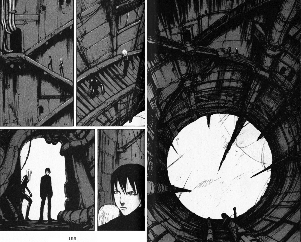
BLAME!, Volume 6, Chapter 36, Pages 152-155 (TOKYOPOP)

MICHELLE: Alrighty. I’ve selected four pages from Tsutomu Nihei’s BLAME!, not for the action—which essentially consists of two people walking around—but for the elegant panel-to-panel storytelling.

BLAME! is a rarity for me in that it’s a series that interested me because of its art rather than it’s story. BLAME! stars Killy, an emotionless young man equipped with a powerful gun, and depicts his journey through a labyrinthine structure of concrete and steel as he searches for humans containing “net terminal genes,” which will allow a person to interface with the netsphere that originally created the sprawling place. The reviews I read praised Nihei’s architectural sensibilities, which was enough to sway me to check out the series. Along the way, Killy acquires a companion in Cibo, whose origins are too complicated to go into, and they begin to journey together. In this sequence they’re ascending to another level of the massive structure, hoping to find a lab where they can read a genetic sample they’ve acquired.

We first see them climbing up a long, spindly column as they approach a circular opening in the roof above them. From the swirling mists and lack of a floor below them, we get the sense that they’ve already been climbing for a long time. In the next set of pages, Killy and Cibo are suddenly walking up a staircase, but the perspective of the scene—showing the circular opening and the column descending out of sight—make absolutely clear how their new position relates to their old one.

On page 155, Killy and Cibo approach a door. This door has four pipes coming out from it, three going up and one to the side. At the bottom of the page, Killy and Cibo are now silhouetted against an opening, and even though we’re looking at them from the other direction now, there are those pipes again, showing us clearly that they’ve now stepped inside.

BLAME! is full of scenes like this. I think it’s another example of the economy we were praising in Akimi Yoshida’s art—readers are given a recognizable landmark or two and that’s all they really need to understand the characters’ movements. It produces a sense of motion while at the same time making this fantastic place seem somehow more real.

MJ: I really love how these panels provide such a sense of scope, and how small and vulnerable the characters are in their environment. You’re absolutely right that it makes the place feel more real.

MICHELLE: This is a zoomed-in moment of their journey, too. When they’re covering a lot of ground, scenery passes more quickly, as if it’s being fast-forwarded. Not that it’s any less detailed or gorgeous, for all that.

MJ: Also, I think the final panel here is effective, too, as small as it is. The pause in the open doorway has an anticipatory feel. I want to know what the character is seeing in front of him.

MICHELLE: Exactly. BLAME! really is a page-turner, and even with its tendency to sometimes not make very much sense, it’s still a quick and enjoyable read. Incidentally, Tsutomu Nihei is also the man behind Biomega, a series currently being released under the VIZ Signature imprint. If anyone’s curious to check out his work, that might be an easier option, since most of BLAME! is now out-of-print.

MJ: I think I’ll check that out myself!

MICHELLE: Well, that’s it for this month’s Let’s Get Visual. We look forward to your feedback and hope you’ll join us again next time!

Let’s Get Visual: Warm-Up Exercises

MICHELLE: Welcome to a brand-new Feature here at Soliloquy in Blue: Let’s Get Visual! Each month, Manga Bookshelf‘s MJ and I will select a page or sequence of pages from our recent manga reads that we find intriguing and attempt to develop our visual-critiquing muscles by sharing our thoughts about it. Neither of us is particularly adept at this, but it’s our hope that by a little regular exercise, we’ll get better.

MJ: Should we talk a little about why we each decided to do this?

MICHELLE: Personally, I’ve always felt that my attempts to discuss comic or manga art have been desultory at best. Usually, they take the form of an afterthought paragraph tacked at the end of the review after I’ve said everything I have to say about the plot and characters. I’ve read a few things about pacing and paneling online and, in general, would simply like to be stronger in this area and train myself to think more about it while I read.

MJ: I think my motivation is very similar. I know what works for me as a reader and I can even take a stab at expressing why, but I don’t really have the vocabulary necessary for discussing the visual aspects of comics, despite my love for them. I’m hoping I’ll get some help with that from the folks who read this column, and that it might give me a greater understanding of this medium that I spend so much of my time thinking and talking about.

MICHELLE: Yes, I’m hoping we’ll get some (hopefully benevolent) guidance, too! With that, shall we get started?

MJ: Yes, let’s!

MICHELLE: For our first attempt, we’ve started simply; I’ve picked one page from volume three of Rei Hiroe’s Black Lagoon while MJ has chosen a sequence of pages from the game-changing fifteenth volume of Yumi Hotta and Takeshi Obata’s Hikaru no Go. All images can be enlarged by clicking on them.

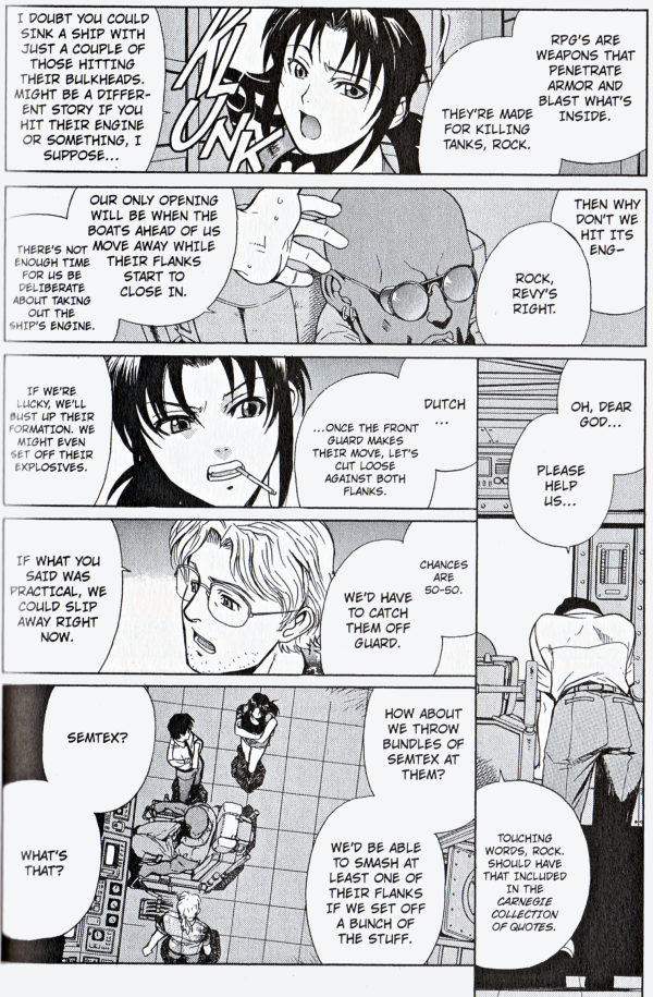
Black Lagoon, Volume 3, Chapter 17, Page 112 (VIZ Media)

MICHELLE: A little background information is required to explain why I found this page from Black Lagoon so interesting. The protagonists of this series are the Lagoon Traders, operating in the waters of South Asia. They routinely accept dangerous jobs, but the one they’re currently on—attempting to deliver detailed Hezbollah plans to a CIA agent—is more fraught with peril than most. They’re being pursued by a number of other vessels and their chances of getting away are slim.

The basic layout of this page—two long horizontal pages on top, one long vertical column on the far right, then some shorter panels on the bottom left—is one that Hiroe has used a few times in the series so far. What struck me in this particular instance is how the flow of the panels directs one’s eye, and how that direction mirrors the characters’ spirits.

In that vertical panel in the bottom right, Rock is dejected. He has finally acknowledged that they’re doomed, and the trailing bottom edge of that panel and placement of Dutch’s dialogue bubble pulls our eyes just about as low as they can go, just like Rock’s hopes. But then Revy has an idea, and our eyes locate her halfway up the page, like a cautious rebound of hope. The rest of the page involves the whole team expanding upon her plan, including the mention of the explosives that will be their ticket to escape.

This may look like a very simple page, but its execution is nothing short of elegant.

MJ: Oh, that is nicely done! I’ll make a comparison here using a medium I do have the vocabulary to discuss intelligently. Your observation here reminds me of something I frequently talk about with my voice students (I used to be a singer, and I still teach) regarding various composers’ level of skill in writing for singers. The best composers tell you everything you need to know about what you should be feeling in any particular moment—whether you’re singing opera, art song, musical theater, whatever—using music only. Pitch, rhythm, dynamics—everything is there if you just pay enough attention, and as long as you use those tools given to you, your audience will understand, whether they speak the language you’re singing in or not.

This visual language reminds me very much of that, and I feel like even if we were looking at this in Japanese, though we’d certainly lack specifics, we’d still comprehend the emotional trajectory of the story here.

MICHELLE: That’s a very apt comparison. Rock’s body language being so easy to read helps, too.

MJ: So, what else do you like about this? I was wondering if you had particular thoughts about the final panel, which suddenly zooms high above them.

MICHELLE: I think this is meant to emphasize how much of a team solution it is. I also love that although the original suggestion about the Semtex does not have a tag on it to designate the speaker, the way everyone else is turned toward Revy suggests that she was the one who spoke.

MJ: Oh, you’re much smarter than I am, though I did have a thought as well. I was thinking about what you said in your original paragraph about the rest of the panels being about the whole team expanding on Revy’s idea, and I thought “expand” was just the word I’d use to describe that final panel. Most of the rest of the page is made up of close-ups, and then that one just zooms way out, suddenly lending a real sense of space.

MICHELLE: Ooh, that’s a very clever point! Go you! Anyway, that’s all I’ve got this time. Why don’t you tell us about the pages you chose?

Hikaru no Go, Volume 15, Chapter 124, Pages 74-77 (VIZ Media)

MJ: Okay, so I’m not even going to introduce these pages, because part of what I think is so brilliant about them is that I don’t have to.

So, you’ve got Hikaru, who is obviously really tired, in that sort of raw way that can only really exist when you’re forcing yourself to be awake. His entire body expresses this, and he’s pretty much holding up his head with his hand. Someone’s talking to him (readers of the series will understand it to be Sai), but Hikaru’s so out of it, he’s not even really with him. Hikaru’s unmoving, frame after frame, in a kind of zone of nothingness.Then something happens at the bottom of the first page and *wham* the door behind Hikaru is sharp again, like the world has shifted from a half-dream state into the harsh light of day.

The real awakening, though, happens on the next page, when Obata widens the lens to make the empty space in the room the focus of panel. This is accented perfectly by the curtains blowing the breeze and the bright sun lighting up the room. Everything is set to evoke a feeling of wide, empty space in this tiny little room. I can almost hear the sounds of everyday life outside that might be wafting in to this quiet room through Hikaru’s open window.

My favorite touch, though, is the way this ends. That wide shot could have easily been the last image in the chapter, and probably it would have had even more impact if it had been. But rather than leave readers with the dramatic lack of Sai, the next two panels bring us back to the *presence* of Hikaru. He’s small, he’s bewildered, and he’s just been awakened in a really harsh way, but there’s a warmth and poignancy in those last two panels that reminds me why I love this series so much.

MICHELLE: There are two things in what you’ve said that really resonate with me. Firstly, I’m struck with the import of the door. I almost feel like I’m back in tenth grade, analyzing poetry, but now that you’ve mentioned its abrupt clarity, I’m convinced that there’s some pretty heavy symbolism behind that door being so conspicuously and firmly shut.

Also, I had the exact same reaction to the open window and billowing curtain—I felt like I could hear the sounds of everyday life carrying on even after something immense has happened. This reminds me of the scene in “The Body,” the fifth-season Buffy the Vampire Slayer episode in which Buffy comes home to find her mother dead on the couch. At one point she steps outside and there’s the world, carrying on as normal while she is going through something devastating.

Lastly, the one thing in that scene that draws my attention in a strange way is the reflection of the books on the floor opposite Hikaru. It’s such a small detail, yet it seems to emphasize the emptiness even more.

MJ: I actually thought of that scene from “The Body” when I was writing here, and I wondered if you’d bring it up! Yes, that’s exactly the kind of thing I mean. I love your observations about the door and the reflection of the books, too. I think you’re absolutely right on both counts.

MICHELLE: I can always be counted on to reference Buffy! It’s interesting that we both chose examples wherein someone has their back to the audience; it seems like that’s something that may not happen too often, though I’ll have to pay more attention from now on to see whether that’s really true. Why do you think Obata decided not to show Hikaru’s expression right away?

MJ: I think he didn’t need to. I think Hikaru and the reader are feeling the same thing in that moment, so illustrating it is totally unnecessary, and doing so might actually lessen the panel’s impact.

MICHELLE: I think so, too. It would place a limit on Hikaru’s comprehension of the situation, as well.

MJ: I also like the fact that when we do see Hikaru’s face in the next panel, it’s not straight-on. The vantage point and slight distance makes it clear that he’s still processing what’s in front of him (or not) . It also makes him appear small and vulnerable, but not in an overly cartoonish way. It’s perfect.

MICHELLE: I agree! Well, how do you think we did, our first time out? We might be a bit sore tomorrow, but it certainly felt good to stretch some little-used muscles.

MJ: I think we did all right… hopefully scoring relatively low on the scale for potential embarrassment. Heh. I’m really looking forward to seeing what kind of wisdom we might glean from our more knowledgeable readers!

MICHELLE: As am I. We look forward to your feedback, and hope that you’ll join us again next month for the next installment of Let’s Get Visual!