Let’s Get Visual: Speechless

MICHELLE: Welcome to the third installment of Let’s Get Visual, a monthly column with Manga Bookshelf‘s MJ in which we flex our artistic muscles!

Although it’s not our intent to have specific themes for each column, we do like responding to requests! Last month, as suggested by a reader, we devoted our column to action scenes. This month, inspired by a comment from Livejournal user Salimbol, we’ve picked scenes that excel in nonverbal communication. I will say right up front that my choice is very, very simple, but it was a scene that left a lasting impression nonetheless. (Click on images to enlarge.)

Kimi ni Todoke: From Me to You, Volume 3, Pages 81-82 (VIZ Media)

MJ: So, what do you particularly like about these pages?

MICHELLE: Maybe it’s the simplicity I like best, actually. I don’t even need to give any context about the manga for anyone to be able to tell the following:

1. Boy sees Girl #1.
2. Girl #1 is oblivious.
3. Boy watches her with a look of warm affection.
4. Girl #2 watches Boy watching Girl #1 and does not like what she sees.

It’s so simple, I wonder if its meant to emphasize the purity and clarity of the feelings the characters share and from which this would-be rival is destined to be forever excluded.

MJ: Well, I think it’s an important moment for Girl #2. She’s watching a boy she likes watch another girl with such unguarded affection. He’s doesn’t even seem to realize or care that she’s still there watching him, he’s so wrapped up in the pure joy of watching the other girl. It’s significant, I think, that the final panels turn the focus back on Girl #2 and what she’s feeling, because this scene really is a revelation for her. I’d almost feel sorry for her if I hadn’t read the book. 😀

MICHELLE: Yeah, me too! I love, also, that the boy radiates almost a sense of peace as he looks upon Girl #1. Even watching her do little things like water plants or practice her kicking skills on a rock brings him joy. It’s scenes like these that make Kimi ni Todoke such a warm and cozy read, I think.

MJ: You’re absolutely right. Also, the artist is so skillful here, I think she could have even left out the final, dreamy image of Girl #1 in the boy’s mind’s eye, and we still would have seen it in our own heads, it’s so clear what he’s thinking of. It’s easy to dismiss the craft in a comic that’s primarily known for being warm and sweet, but that would be such a mistake here. This whole sequence is just really well done.

MICHELLE: And the memory of it stayed with me. It’s been five months since I read this volume, but it was the first thing I thought of when the topic of nonverbal communication was suggested.

The second thing I thought of is what you ended up choosing, interestingly enough!

MJ: Shall I introduce that, then?

MICHELLE: Go for it!

Antique Bakery, Volume 4, Pages 116-120 (Digital Manga Publishing)

MJ: Okay, well, the scene is from Fumi Yoshinaga’s Antique Bakery. One of the traits I associate most with her as an artist is her use of silent panels, and this is the one that first came to my mind when you mentioned Salimbol’s request. It’s a scene between the story’s two main characters that is revisited multiple times throughout the manga. It’s really the beginning of their history together, despite the fact that it’s quite far in the past from when the main action of the story is set. This is one of its final appearances in the series, late in the fourth volume.

To help illustrate how effective I think the visual storytelling is in this scene, I’ve actually provided scans from the Japanese version of the series. Even without being able to read the small amount of dialogue here, and despite how important the first bit of dialogue is to the history of these characters, I think the emotional trajectory of the scene is crystal clear.

Boy #1 says something emphatic to Boy #2. Boy #2 is visibly upset, and though he attempts to maintain his composure, he eventually breaks down and flees the scene. Boy #1 ponders what he’s done, finally succumbing to deep regret .

What Yoshinaga captures so well is subtlety of emotion and the agony of time. The progression of the characters’ expressions during this sequence are almost painfully slow, placing the reader in the same sort of stopped-time state each of the boys is experiencing—that sense of being frozen in one time and place that only happens in moments of deeply negative emotion. Nobody gets off easy, especially Boy #1, who is stuck living with the consequences of his actions long after Boy #2 has escaped from the moment. The art is so simple, but the effect is chilling.

MICHELLE: I positively adore the phrase “the agony of time.” Yoshinaga uses repeated sequences of panels quite a lot, and while this one is painful, I can recall others that cycle through surprise, thoughtfulness, and then smiling acceptance. It’s a technique that’s very versatile!

Here, I find myself struck by the third and fourth pages particularly, particularly as regards where Boy #1 is placed on the page. The third page emphasizes how very alone he now is, after driving off his companion, and the fourth places him very low on the page. I wonder if this last reflects his opinion of himself, after he has treated his classmate so shabbily.

MJ: I wondered that as well! And yes, the empty space that’s left in the wake of Boy #2’s departure is significant in terms of how we experience the scene and the state of mind Boy #1 has been left in. Though our sympathy, of course, goes out naturally to Boy #2, it’s hard not to be moved by Boy #1’s obvious regret. As a reader, I want to somehow reach into the page and compel him to go after Boy #2, which adds a bit of frustration to the mix as well.

MICHELLE: Yes, this definitely emphasizes how stuck he is, both physically and mentally. And will continue to be, even after he moves from this spot, as the story makes clear that Boy #2 has moved on from this moment but Boy #1 has never been able to quite forgive himself for it.

MJ: It’s really quite brilliant, the way she tells the stories of these two men, isn’t it?

MICHELLE: It really is. I suspect “Yoshinaga” is actually just a synonym for “brilliant.”

MJ: I really don’t know what to say after that. 🙂

MICHELLE: Maybe we should take our cue from these artists and know when to remain silent!

That’s it for this month’s Let’s Get Visual. Thank you for joining us and, as always, please feel free to share your personal opinions on these pages in the comments!

Let’s Get Visual: Annnnnd Action!

MICHELLE: Welcome to the second installment of Let’s Get Visual, the monthly column in which MJ (of Manga Bookshelf) and I attempt to improve our admittedly lacking skills in visual analysis!

In the comments section of last month’s post, it was suggested that we choose selections that would allow us to “examine movement and panel-to-panel storytelling.” This notion intrigued us, so MJ and I have done our best to fulfill this request, though I must admit that mine doesn’t exactly meet the qualifications of an “action-heavy scene.”

MJ: I admit I found the request a little daunting. Though I read a lot of manga that contain action sequences, I tend to kind of zone out during many of those moments, particularly if I find the action difficult to follow. Then I realized, of course, that this offered a great opportunity to think about instances in which action scenes really work for me and why.

MICHELLE: When we first received this request, I thought I might end up choosing a fight sequence from One Piece, but in the end, I found a low-key scene that nonetheless inspired awe. But enough of me, why don’t you start us off this time? And remember, folks—all images can be enlarged by clicking on them.

Banana Fish, Volume 8, Pages 130-135 (VIZ Media)

MJ: Since we just finished the latest installment of our roundtable discussion, Breaking Down Banana Fish, I had Akimi Yoshida’s Banana Fish on the brain, so the pages I’ve chosen are from that series, late in volume eight. The story’s protagonist, gang leader Ash Lynx, is engaged in a showdown with his enemy, Frederick Arthur. The fight was supposed to be one-on-one, knife only, with a neutral witness in a closed subway station, but Arthur has used his mob ties to pull off an ambush with a subway train full of his gun-toting boys. Once Arthur breaks the rules, though, the fight’s original witnesses (there end up being two) call out their own boys to back up Ash, so Arthur’s gang attempts to retreat on the same train they arrived in. That’s where these panels begin.

What really strikes me here is Yoshida’s use of sound effects throughout these panels. I’m the kind of reader who generally ignores sound effects, but here they are vital to the tone of the scene. In this empty, echoing subway station filled with a lot of really tense guys, it’s the sounds that drive their responses more than anything. Sing’s gang bursting out of their hiding places, Ash’s gun releasing its empty shells onto the cement floor, bullets reloading, the echoing gunfire, and then the labored clacks of the subway train pulling away, leaving Cain and Sing behind in the emptiness of the station—these sounds dominate each page and move the action forward. Whoever’s decision it was to translate these sound effects into English really made the right call, in my view, because this entire sequence would die without the full comprehension of the sounds.

I particularly like the second-to-last page, in which both Ash and Arthur stand separately, with only the heavy clack of the train and the sounds of their own, tense, breathing in their heads. That panel makes the silence surrounding Cain and Sing on the last page feel even more intense.

MICHELLE: I think you may be on to something there. Now that I’ve reread it and paid special attention to the sound effects (which, by the way, I always read, even if they’re in katakana!) I can completely see how the loudness of the train followed by the absence of sound emphasizes the emptiness of the station as well as Ash’s shocking departure.

When I first read this scene, the part that struck me the most was the top right of the second two-page spread, where Ash eyes the door, we see a foot, and then he comes sailing through it. I love how this was conveyed so economically, and in a way that allows us to fill in all the steps in between.

MJ: I’m really glad you brought that up, because I think economy is really the key in drawing clear action sequences. Some of the backgrounds here are pretty cluttered, due to the heavy graffiti on & in the subway cars, so it’s the clear, simple action shots that help keep our focus. There are a lot of speed lines here, but they are thin and subtle, drawing our eyes in the right direction without making us aware of them. And her choice of details is spot on.

For instance, when Ash is ripping tape off of his leg to get at the extra bullets he carries, Yoshida focuses on Ash’s pained face as the tape comes off, rather than the action itself, with the sound effect cluing us in. Then she follows it up with a close-up on the bullets going into the gun. She goes from precise actions like these into increasingly broader frames, until the bottom of the page where we finally see Ash opened up against Arthur’s gang. It’s so effective, the way she takes us from the tense intimacy of Ash’s personal space into the vulnerability of the wide-open platform, so that we experience the progression just as he does.

MICHELLE: That’s an excellent description of what’s going on. Interestingly, the consideration of perspective—where our characters are in relation to the world they inhabit—figures large in my example, as well.

MJ: Let’s talk about that then, shall we?

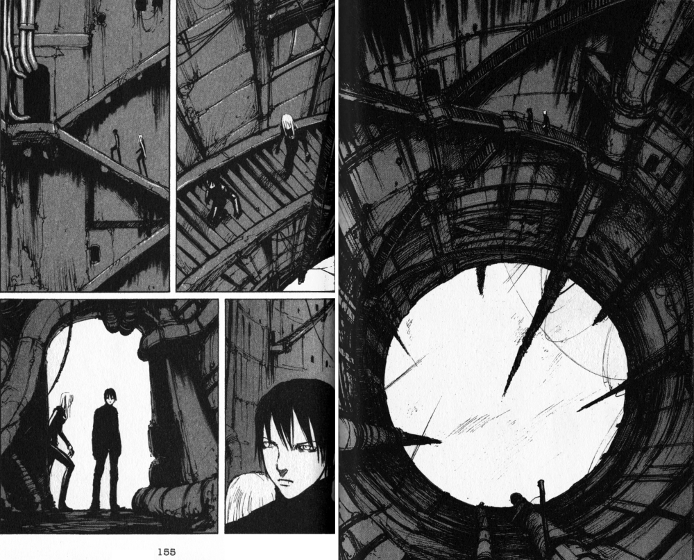
BLAME!, Volume 6, Chapter 36, Pages 152-155 (TOKYOPOP)

MICHELLE: Alrighty. I’ve selected four pages from Tsutomu Nihei’s BLAME!, not for the action—which essentially consists of two people walking around—but for the elegant panel-to-panel storytelling.

BLAME! is a rarity for me in that it’s a series that interested me because of its art rather than it’s story. BLAME! stars Killy, an emotionless young man equipped with a powerful gun, and depicts his journey through a labyrinthine structure of concrete and steel as he searches for humans containing “net terminal genes,” which will allow a person to interface with the netsphere that originally created the sprawling place. The reviews I read praised Nihei’s architectural sensibilities, which was enough to sway me to check out the series. Along the way, Killy acquires a companion in Cibo, whose origins are too complicated to go into, and they begin to journey together. In this sequence they’re ascending to another level of the massive structure, hoping to find a lab where they can read a genetic sample they’ve acquired.

We first see them climbing up a long, spindly column as they approach a circular opening in the roof above them. From the swirling mists and lack of a floor below them, we get the sense that they’ve already been climbing for a long time. In the next set of pages, Killy and Cibo are suddenly walking up a staircase, but the perspective of the scene—showing the circular opening and the column descending out of sight—make absolutely clear how their new position relates to their old one.

On page 155, Killy and Cibo approach a door. This door has four pipes coming out from it, three going up and one to the side. At the bottom of the page, Killy and Cibo are now silhouetted against an opening, and even though we’re looking at them from the other direction now, there are those pipes again, showing us clearly that they’ve now stepped inside.

BLAME! is full of scenes like this. I think it’s another example of the economy we were praising in Akimi Yoshida’s art—readers are given a recognizable landmark or two and that’s all they really need to understand the characters’ movements. It produces a sense of motion while at the same time making this fantastic place seem somehow more real.

MJ: I really love how these panels provide such a sense of scope, and how small and vulnerable the characters are in their environment. You’re absolutely right that it makes the place feel more real.

MICHELLE: This is a zoomed-in moment of their journey, too. When they’re covering a lot of ground, scenery passes more quickly, as if it’s being fast-forwarded. Not that it’s any less detailed or gorgeous, for all that.

MJ: Also, I think the final panel here is effective, too, as small as it is. The pause in the open doorway has an anticipatory feel. I want to know what the character is seeing in front of him.

MICHELLE: Exactly. BLAME! really is a page-turner, and even with its tendency to sometimes not make very much sense, it’s still a quick and enjoyable read. Incidentally, Tsutomu Nihei is also the man behind Biomega, a series currently being released under the VIZ Signature imprint. If anyone’s curious to check out his work, that might be an easier option, since most of BLAME! is now out-of-print.

MJ: I think I’ll check that out myself!

MICHELLE: Well, that’s it for this month’s Let’s Get Visual. We look forward to your feedback and hope you’ll join us again next time!

Let’s Get Visual: Warm-Up Exercises

MICHELLE: Welcome to a brand-new Feature here at Soliloquy in Blue: Let’s Get Visual! Each month, Manga Bookshelf‘s MJ and I will select a page or sequence of pages from our recent manga reads that we find intriguing and attempt to develop our visual-critiquing muscles by sharing our thoughts about it. Neither of us is particularly adept at this, but it’s our hope that by a little regular exercise, we’ll get better.

MJ: Should we talk a little about why we each decided to do this?

MICHELLE: Personally, I’ve always felt that my attempts to discuss comic or manga art have been desultory at best. Usually, they take the form of an afterthought paragraph tacked at the end of the review after I’ve said everything I have to say about the plot and characters. I’ve read a few things about pacing and paneling online and, in general, would simply like to be stronger in this area and train myself to think more about it while I read.

MJ: I think my motivation is very similar. I know what works for me as a reader and I can even take a stab at expressing why, but I don’t really have the vocabulary necessary for discussing the visual aspects of comics, despite my love for them. I’m hoping I’ll get some help with that from the folks who read this column, and that it might give me a greater understanding of this medium that I spend so much of my time thinking and talking about.

MICHELLE: Yes, I’m hoping we’ll get some (hopefully benevolent) guidance, too! With that, shall we get started?

MJ: Yes, let’s!

MICHELLE: For our first attempt, we’ve started simply; I’ve picked one page from volume three of Rei Hiroe’s Black Lagoon while MJ has chosen a sequence of pages from the game-changing fifteenth volume of Yumi Hotta and Takeshi Obata’s Hikaru no Go. All images can be enlarged by clicking on them.

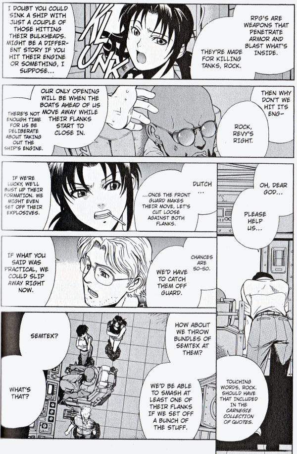
Black Lagoon, Volume 3, Chapter 17, Page 112 (VIZ Media)

MICHELLE: A little background information is required to explain why I found this page from Black Lagoon so interesting. The protagonists of this series are the Lagoon Traders, operating in the waters of South Asia. They routinely accept dangerous jobs, but the one they’re currently on—attempting to deliver detailed Hezbollah plans to a CIA agent—is more fraught with peril than most. They’re being pursued by a number of other vessels and their chances of getting away are slim.

The basic layout of this page—two long horizontal pages on top, one long vertical column on the far right, then some shorter panels on the bottom left—is one that Hiroe has used a few times in the series so far. What struck me in this particular instance is how the flow of the panels directs one’s eye, and how that direction mirrors the characters’ spirits.

In that vertical panel in the bottom right, Rock is dejected. He has finally acknowledged that they’re doomed, and the trailing bottom edge of that panel and placement of Dutch’s dialogue bubble pulls our eyes just about as low as they can go, just like Rock’s hopes. But then Revy has an idea, and our eyes locate her halfway up the page, like a cautious rebound of hope. The rest of the page involves the whole team expanding upon her plan, including the mention of the explosives that will be their ticket to escape.

This may look like a very simple page, but its execution is nothing short of elegant.

MJ: Oh, that is nicely done! I’ll make a comparison here using a medium I do have the vocabulary to discuss intelligently. Your observation here reminds me of something I frequently talk about with my voice students (I used to be a singer, and I still teach) regarding various composers’ level of skill in writing for singers. The best composers tell you everything you need to know about what you should be feeling in any particular moment—whether you’re singing opera, art song, musical theater, whatever—using music only. Pitch, rhythm, dynamics—everything is there if you just pay enough attention, and as long as you use those tools given to you, your audience will understand, whether they speak the language you’re singing in or not.

This visual language reminds me very much of that, and I feel like even if we were looking at this in Japanese, though we’d certainly lack specifics, we’d still comprehend the emotional trajectory of the story here.

MICHELLE: That’s a very apt comparison. Rock’s body language being so easy to read helps, too.

MJ: So, what else do you like about this? I was wondering if you had particular thoughts about the final panel, which suddenly zooms high above them.

MICHELLE: I think this is meant to emphasize how much of a team solution it is. I also love that although the original suggestion about the Semtex does not have a tag on it to designate the speaker, the way everyone else is turned toward Revy suggests that she was the one who spoke.

MJ: Oh, you’re much smarter than I am, though I did have a thought as well. I was thinking about what you said in your original paragraph about the rest of the panels being about the whole team expanding on Revy’s idea, and I thought “expand” was just the word I’d use to describe that final panel. Most of the rest of the page is made up of close-ups, and then that one just zooms way out, suddenly lending a real sense of space.

MICHELLE: Ooh, that’s a very clever point! Go you! Anyway, that’s all I’ve got this time. Why don’t you tell us about the pages you chose?

Hikaru no Go, Volume 15, Chapter 124, Pages 74-77 (VIZ Media)

MJ: Okay, so I’m not even going to introduce these pages, because part of what I think is so brilliant about them is that I don’t have to.

So, you’ve got Hikaru, who is obviously really tired, in that sort of raw way that can only really exist when you’re forcing yourself to be awake. His entire body expresses this, and he’s pretty much holding up his head with his hand. Someone’s talking to him (readers of the series will understand it to be Sai), but Hikaru’s so out of it, he’s not even really with him. Hikaru’s unmoving, frame after frame, in a kind of zone of nothingness.Then something happens at the bottom of the first page and *wham* the door behind Hikaru is sharp again, like the world has shifted from a half-dream state into the harsh light of day.

The real awakening, though, happens on the next page, when Obata widens the lens to make the empty space in the room the focus of panel. This is accented perfectly by the curtains blowing the breeze and the bright sun lighting up the room. Everything is set to evoke a feeling of wide, empty space in this tiny little room. I can almost hear the sounds of everyday life outside that might be wafting in to this quiet room through Hikaru’s open window.

My favorite touch, though, is the way this ends. That wide shot could have easily been the last image in the chapter, and probably it would have had even more impact if it had been. But rather than leave readers with the dramatic lack of Sai, the next two panels bring us back to the *presence* of Hikaru. He’s small, he’s bewildered, and he’s just been awakened in a really harsh way, but there’s a warmth and poignancy in those last two panels that reminds me why I love this series so much.

MICHELLE: There are two things in what you’ve said that really resonate with me. Firstly, I’m struck with the import of the door. I almost feel like I’m back in tenth grade, analyzing poetry, but now that you’ve mentioned its abrupt clarity, I’m convinced that there’s some pretty heavy symbolism behind that door being so conspicuously and firmly shut.

Also, I had the exact same reaction to the open window and billowing curtain—I felt like I could hear the sounds of everyday life carrying on even after something immense has happened. This reminds me of the scene in “The Body,” the fifth-season Buffy the Vampire Slayer episode in which Buffy comes home to find her mother dead on the couch. At one point she steps outside and there’s the world, carrying on as normal while she is going through something devastating.

Lastly, the one thing in that scene that draws my attention in a strange way is the reflection of the books on the floor opposite Hikaru. It’s such a small detail, yet it seems to emphasize the emptiness even more.

MJ: I actually thought of that scene from “The Body” when I was writing here, and I wondered if you’d bring it up! Yes, that’s exactly the kind of thing I mean. I love your observations about the door and the reflection of the books, too. I think you’re absolutely right on both counts.

MICHELLE: I can always be counted on to reference Buffy! It’s interesting that we both chose examples wherein someone has their back to the audience; it seems like that’s something that may not happen too often, though I’ll have to pay more attention from now on to see whether that’s really true. Why do you think Obata decided not to show Hikaru’s expression right away?

MJ: I think he didn’t need to. I think Hikaru and the reader are feeling the same thing in that moment, so illustrating it is totally unnecessary, and doing so might actually lessen the panel’s impact.

MICHELLE: I think so, too. It would place a limit on Hikaru’s comprehension of the situation, as well.

MJ: I also like the fact that when we do see Hikaru’s face in the next panel, it’s not straight-on. The vantage point and slight distance makes it clear that he’s still processing what’s in front of him (or not) . It also makes him appear small and vulnerable, but not in an overly cartoonish way. It’s perfect.

MICHELLE: I agree! Well, how do you think we did, our first time out? We might be a bit sore tomorrow, but it certainly felt good to stretch some little-used muscles.

MJ: I think we did all right… hopefully scoring relatively low on the scale for potential embarrassment. Heh. I’m really looking forward to seeing what kind of wisdom we might glean from our more knowledgeable readers!

MICHELLE: As am I. We look forward to your feedback, and hope that you’ll join us again next month for the next installment of Let’s Get Visual!

NANA Project #7!

So very much happens in volumes thirteen and fourteen of NANA that one could easily expend 1000 words on plot synopsis alone. Hachi grows somewhat stronger, Nana sustains some painful blows, several of the fellows aren’t on their best behavior, and some peripheral characters grow in importance. In a way, this feels like a new phase in the series, and these two installments aren’t as heartbreaking to read as some others have been.

Danielle Leigh, MJ, and I discuss these volumes in more depth in our seventh entry in the NANA Project series at Comics Should Be Good. Check it out!

MMF: That’s a Wrap!

The Paradise Kiss MMF has now come to a close. Thank you again to everyone who participated—each contribution was a pleasure to read, and their quality made my job as host both easy and fun!

Tune in next month when we’ll be doing something a little bit different with the MMF: a kids’ table! Our main course will be Yotsuba&!, but we’ll also be feasting upon a variety of tasty (and kid-friendly) side dishes. The festivities will be hosted by the team at Good Comics for Kids, so be sure to keep an eye on their blog for details.

The complete archive for the Paradise Kiss MMF can be found here.

MMF: Weekend Edition

The Paradise Kiss MMF is winding down, but there are still some new contributions to highlight.

Proving once and for all that manga isn’t just for kids, Derik Badman shared his academic paper, “Talking, Thinking, and Seeing in Pictures: Narration, Focalization, and Ocularization in Comics Narratives,” for which he used Paradise Kiss as an example:

Were I able to spend the time, the shifting focalizations of Paradise Kiss would prove a fertile ground for further investigation. In contrast to the previous examples, this manga uses more wide-ranging effects of focalization and ocularization in regard to a larger number of characters, but it is all enclosed in the retrospective internally focalized narration of Yukari herself.

Meanwhile, at Manga Kaleidoscope, Zoe Alexander’s review focuses on the relationships but doesn’t forget about the clothes! Here, she talks about a scene that makes her cry every time and I am right there with you, Zoe!

I also really liked the symbolism behind the clothes. To George, every design he makes holds an important memory to him, so for him to allow Yukari to wear them shows just how much he really loved her, despite the way he treated her at times. The scene near the end, where Yukari realizes that he’s left all his designs to her even though they’ve broken up, makes me cry every time. It’s his way of saying “I love you,” and so uniquely George.

Jason Green, Sarah Boslaugh, and Erin Jameson contribute to a great panel discussion on Paradise Kiss at PLAYBACK:stl. I particularly like this bit about the order in which Yukari asks herself some fundamental questions:

The end of high school always leaves one awash in feelings of “Who am I? Who do I want to be? Where do I want to go to college? What do I want to do with the rest of my life?” And Yukari is confronting those same issues, but through the lens of someone who basically upheaved her entire life by quitting school, changing friends, leaving home, and becoming a model—before she started asking herself those questions. It’s only natural in those circumstances to ask yourself “Am I becoming who I’m meant to be, or am I only doing this because of this weird new environment I’ve plopped myself into?”

At Slightly Biased Manga, Connie has posted an essay about the way she identifies with Yukari, the protagonist of Paradise Kiss. I had remembered she was a fan, but when I visited her site to read her reviews, I noticed there weren’t any. “Strange,” I thought. Here, she explains why that is:

I’m no fashion model (in case you couldn’t guess). I didn’t rebel in the way that Yukari did. I never went on to have the spectacular life that Yukari lived (proving that even the most sympathetic manga have to have some element of wish fulfillment). But every time I picked up a volume of that series, it made me cry. It still does, and I have never reviewed any of it, because it’s just too personal. The character emotions and the things they deal with in their lives are spectacular, Ai Yazawa is an excellent writer, and I was of the right age when I read this, but all the same, I still really feel this one.

Lastly, Jason S. Yadao posts to the Honolulu Star-Advertiser urging readers to check out Paradise Kiss. He concludes with these words:

Yazawa just has a way of crafting wonderful, down-to-earth gritty situations for her characters to deal with—see NANA, her current series, for proof of that—and I can’t recommend it enough.

Forsooth!

For more on Paradise Kiss, visit the MMF Archive.

MMF: The Isabella Appreciation Society

There are a couple of new MMF contributions to mention today, and both take time to bestow some praise upon Isabella, the “elegant transvestite.”

Over at The Manga Curmudgeon, David Welsh dusts off a 2005 column on Paradise Kiss and freshens it up with some new thoughts. I love his insightful take on Isabella’s function in the story:

I was initially a bit annoyed by the suspicion that Isabella, the elegant transvestite, would stay too far in the background, looking lovely and composed and not doing much of anything. And while it’s true that she gets the least amount of time in the spotlight, well, somebody has to be the grown-up in this crowd. Isabella is the quiet, reassuring eye of a storm of self-reinvention, and it makes perfect sense. Isabella has already reinvented herself to her own satisfaction, so who better to nurture her works-in-progress friends?

In our weekly Off the Shelf column at Manga Bookshelf, MJ and I focus our discussion on the characters of Paradise Kiss. Although our feelings about George and ability to sympathize with Yukari differ, we both agree that Isabella is terrific:

MICHELLE: I think with Ai Yazawa there’s always a distinction to be made between characters who are excellently developed, three-dimensional people with fascinating flaws and characters who are one’s favorites by virtue of being just plain likeable. In the latter category, for example, I would place Isabella. She’s warm and nurturing, and completely devoted to George for accepting her as she is. If I had a problem, I’d like to pour my heart out to her while she made me some tasty stew.

But in terms of a character that one could simply talk about for days, I think I’d have to go with George. He’s maddening and unpredictable, but man, those moments when he looks hurt and vulnerable really pull at one’s heartstrings. It’s easy to see why Yukari fell for him.

MJ: It’s interesting that you bring up these two characters specifically, because I have such contrasting feelings about them. Isabella is my favorite character in the series by far… Not only is she a wonderfully warm and nurturing character, as you mention here, but she’s also the one who is best able to see the truth about everyone else, unhindered by insecurity or personal bias.

Additionally, she’s just about 100% responsible for my ability to like George, which took a hell of a long time to develop, to be honest. It took me several times through the series to get over my deep intolerance of George’s refusal to take responsibility for his role in the lives of others, and it was only Isabella who was able to convince me that George’s unquestioning, immediate acceptance of her true self made him worth reconsidering… If it wasn’t for Isabella, though I’d have to concede that George is an absolutely fascinating character, I wouldn’t like him at all.

For more on Paradise Kiss, visit the MMF Archive.

MMF: Another Day in Paradise

Each day brings more terrific musings upon a terrific series! Today, we have three!

At Manga Xanadu, Lori Henderson has posted a review of the first volume and makes a nice comparison of her own initial avoidance of the series and Yukari’s preconceptions about the members of Paradise Kiss.

Just like with NANA, I was pulled into this series from the first chapter and hooked by the characters. Their complex relationships really draw you in, as does the enigmatic George. It’s easy to get just as caught up in his games as Yukari does. Like Yukari, I made the mistake of judging this title by its outward appearance. I’m glad the MMF gave me a push to check out this series. I’m now looking forward to reading more and seeing the fashion come into play, as well as where George and Yukari’s relationship will go, or if it will last.

Sean Gaffney’s take on the series is up at his blog, A Case Suitable for Treatment. If you’re curious about the series’ publishing history, Sean’s got you covered, though he does plenty of enthusing, as well. Here’s a sample:

It also features one of the great supporting casts in manga. Each of the six characters I’d call leads (Yukari, George, Arashi, Miwako, Isabella and Hiroyuki) are well-written characters with their own lives and problems, and the manga succeeds very well in avoiding a typical shoujo pitfall of having everyone be there to facilitate the heroine’s romance. Partly this is because they’re all so interesting in and of themselves (it’s arguable that the Arashi/Miwako/Hiroyuki subplot is more fascinating than Yukari’s), but partly because for once, this is a romance you may not want to see helped along.

At Comic Attack, Kristin has posted her review, which takes the extra step of discussing the anime as well as the manga. It’s a fun and lively read, and I think my very favorite bit is this passage about George:

Now we can talk about George. As a character, he’s hard to beat. George is cold, cruel, arrogant, and emotionally warped. As a romantic partner he’s about the worst guy you could find, but as a character he’s incredibly fascinating. And, despite how twisted he can be, he’s actually pretty great for Yukari. He makes her grow up and take control of her own life. It doesn’t really happen in the nicest way, but sometimes a swift kick in the ass is what you need. For that, he’s perfect. But beyond that?

For more on Paradise Kiss, visit the MMF Archive.

The Paradise Kiss MMF is Underway!

The Paradise Kiss MMF has just begun, and some fantastic submissions are already coming in!

Ed Sizemore at Manga Worth Reading has posted his thoughtful take on the series, which includes this observation on the role of realism in the story:

The series has the feeling of a fairy tale. Not the light, frothy ones that get told today, but the original ones that blended a sense of reality and fantasy to create compelling, yet reassuring, stories. Realism is seen in the way George’s and Yuraki’s relationship progresses and ends. It’s further seen in the fact that Paradise Kiss doesn’t become an overnight fashion hit. The lack of a Hollywood perfect ending is part of what makes this a satisfying read.

Hisui and Narutaki of Reverse Thieves have contributed a fascinating discussion about one of the series’ supporting characters, entitled Hiroyuki: One Point on Two Triangles. I’m so glad someone devoted some consideration to this character, who ended up having a much greater purpose than I’d been expecting.

Hiro is an unexpected linchpin in the complicated relationships of Paradise Kiss. He is the foil, the good guy, the guy that got away, the childhood friend, and the first love and he occupies a spot in two completely different triangles of love… In many ways the girls, Yukari and Miwako, don’t realize the triangle exists; they are so focused on their current love affairs that there is little room for another. But George and Arashi are a different story. Their insecurities brightly manifest because of Hiro, each reacting to the threat, one with feigned indifference and the other with jealous anger. They both believe Hiro is better for their respective love interests than they are, and even the reader, as much as we fall in love with George and Arashi, [worries] they might be right.

Lastly, my review of the series has also gone up, and it’s probably the longest thing I’ve ever written. Perhaps it’s gauche to quote oneself in a post of this type, but I admit a fondness for this paragraph:

Any human emotion you can possibly think of is present in Paradise Kiss. Characters are seen at their best and at their worst. Some achieve their dreams, some come close, and some must resign themselves to helping others achieve theirs. It’s not a particularly happy story, but it’s not a particularly sad one, either. The overall feeling I take away from it is one of hope. After all, even though things sometimes don’t go as you planned, “nothing will happen if you don’t believe in your own possibilities.”

For more on Paradise Kiss, visit the MMF Archive.

MMF: An Introduction to Paradise Kiss

Paradise Kiss is a five-volume josei series by Ai Yazawa that originally ran in Zipper, a Japanese fashion magazine. It’s the story of Yukari Hayasaka, a stressed-out high school student who has always done what was expected of her and has never had a dream of her own. This changes when she meets the members of Paradise Kiss, a group of fashion design students who ask her to model their creation for a school festival. Initially predisposed to think them freaks, she’s soon won over by their determination and realizes how good it feels to be part of something creative.

While Yukari decides to pursue a career in modeling rather than follow the path set forth by her demanding mother, she also falls in love with George, the unpredictable and difficult-to-understand leader of Paradise Kiss. Their romance is a tumultuous one, but they support each other, too, with Yukari helping to make the festival a success and George challenging Yukari to stop blaming others for her problems and show some initiative of her own. But what will happen when the pursuit of their dreams threatens to take them in different directions?

The story’s richly drawn characters, with merits and flaws aplenty, have been commented on by several reviewers.

From Da-manta-ray:

“I did like the fact that [Yukari] had more realistic flaws than what you see in other manga: she starts off prejudiced to the bohemian-esque lifestyle of George and the other Yazawa Art school students, but really, she just wants an escape from the world that’s trapped her in this small box and narrow-minded way of living.”

From MJ:

“All of the story’s characters are very real people and very much human, with all that entails. They are mostly nice, a little bit broken, occasionally cruel or selfish, but also capable of real love and kindness… The supporting players are no less rich, which is particularly impressive in a series this short… What makes these characters feel so real, despite their lesser “screen time,” is that every time they appear, bits of their offscreen lives are carried along with them. They do not exist simply as people for the main couple to interact with, but very obviously have their own full lives, with their own dreams and ambitions, some of which are only hinted at in the story itself.”

A manga about fashion requires oustanding art. Thankfully, Ai Yazawa’s style is well-suited to answering that demand.

From Johanna Draper Carlson:

“The unique art is well able to capture all these varied styles accurately. The approach ranges from elegant and detailed to sparse manga shorthand concentrating on emotion. The gorgeous fashion images, inspired by classic magazine illustration styles and evoking an era of elegance, are woven throughout the story.”

From Dawn-sama:

“Let’s start with the obvious points: the art in Paradise Kiss is superb. If the story doesn’t suck you in, the art will. Ai Yazawa has an elegant, sophisticated pop style and she pays meticulous attention to detail. As expected, the outfits in this fashion manga are very chic and stylish, and the fashion designs from the characters range from elegant to downright odd to Elegant Gothic Lolita. The character designs are excellent. I thought the designs of the major characters really matched their personalities, and considering their personalities, this ends as quite a feat.”

In addition to being a romance, Paradise Kiss also functions as a coming-of-age story, and poses a lot of questions that face many on the cusp of adulthood:

From Johanna Draper Carlson:

“What is the difference between love and obsession? How can you love someone you hate and hate someone you love? Is love a good thing if you become so consumed by it that you make yourself sick? … In the bigger picture, how much of who we are is who we pretend to be?”

If this series sounds appealing to you, you’re welcome to join in on the Manga Moveable Feast! Our feature on Paradise Kiss will run through next Sunday, August 1. All you need to do is e-mail me a link to your contribution (or the review itself, which I can post here on your behalf). You may also wish to join the Google Group for updates, conversation, and an opportunity to vote on nominees for future feasts!

Archive in progress.